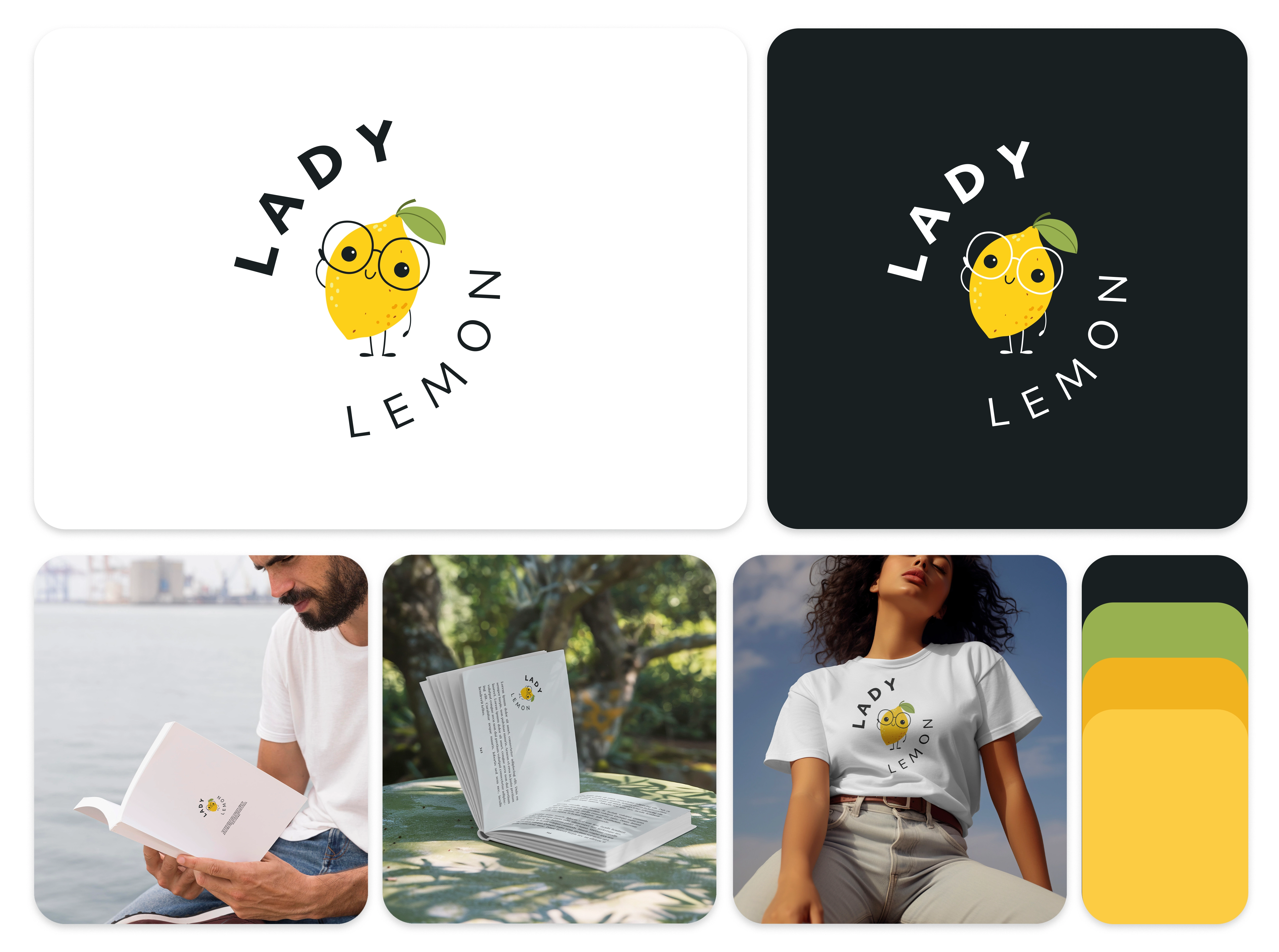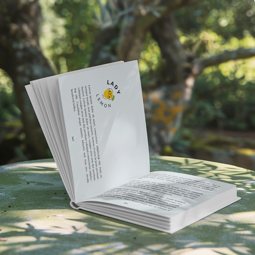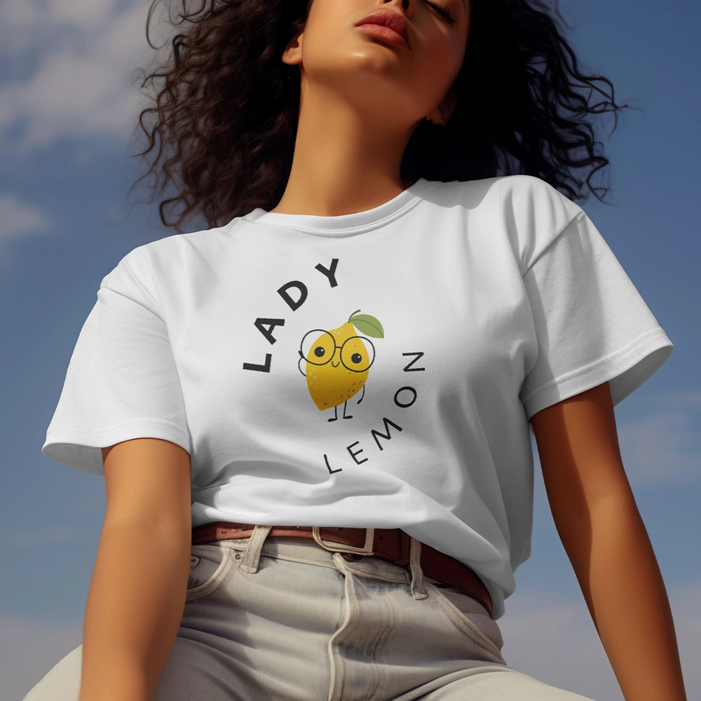
Lady Lemon is a bright, cheerful identity built around a lovable lemon character and a clean circular lock-up system. The concept is designed to feel approachable at first glance, while remaining strong enough to stand out on packaging, labels, stickers, and digital content. The visual language uses simple shapes and confident typography to communicate freshness, cleanliness, and everyday joy. The character-led mark gives the brand personality, and the flexible layout system ensures the logo works across different formats without losing recognition. The result is a playful yet professional brand identity that scales smoothly from small icons to large signage and supports long-term consistency across touchpoints.
Info
-
ClientLady Lemon
-
CategoryF&B / Lifestyle
-
ServicesLogo Design • Brand Identity • Visual System • Color Direction • Application Mockups
-
TagsFresh, friendly, and instantly memorable.